Ephemeral Wetland at Pleasant Grove
Oak Forest at Pleasant Grove Pond
Oak Forest at Pleasant Grove Pond
In Defense of the Small Print

A collection of small Ansel Adams prints
Over the past dozen years or more, there has been a trend in fine art photography toward exhibiting larger and larger prints. For example, Andreas Gursky’s Rhein II, which is one of the most expensive photographs ever sold, measures 81”x151” framed. While this is an extreme example, at almost any contemporary photography show—even at the local level—one will find many prints in the 20”x30” range and larger. Besides benefitting galleries by driving prices upward, this trend has also benefitted the camera industry by fueling a megapixel and lens resolution arms race that continues on unabated. It seems the “bigger is better” mentality has fully infiltrated the photography world.
While I have done some printing in larger sizes, and will most likely continue to do so in the future, my personal preference is for smaller prints. Something around the size of a coffee table book seems ideal, in that range between 10”x10” and 14”x14". I like the intimacy of getting up close to an print (or even better, holding a physical print in hand) while still being able to see the entire image. Oversized prints force the viewer to back away, and getting up close feels too much like pixel peeping on a 5K monitor; it’s the rare oversized print that can withstand that kind of scrutiny.
Recently, I was fortunate enough to view a set of small Ansel Adams silver prints in the 8”x10” to 10”x12” range. They were absolutely gorgeous. I don’t believe they would have been any more enjoyable in larger sizes. In fact, I felt as if the small sizes drew me right in, inviting me to inspect the fine details at close range. The great Michael Kenna also prints small, with a majority of his prints over the past 30 years being no larger than 8”x8”. Here’s what he has to say about small prints:
"I prefer the intimacy of the smaller print. I experimented with 16”x20" prints in the late 80's but later destroyed most of them. Some collectors really like them but they just didn’t feel right for me. Apart from the more obvious technical and optical considerations, what is more important for me is the relationship that a viewer has with the print. The eye comfortably views and focuses an angle of about 30 degrees. This translates into a viewer comfortably standing about 10 inches away from a 4”x5" print and 3 1/2 feet away from a 16”x20" print. Small prints have a greater feeling of intimacy - one looks into the print. Large prints are more awesome - they are something a viewer looks out at. I believe in fitting the print size to one’s particular vision and prefer the more intimate engagement of the smaller image."
I couldn’t agree more!
Rectangles and Squares
Valley Oak at Sunrise
ASPECT RATIOS
Before the advent of digital photography, the physical characteristics of the recording medium (film) had much to do with the physical characteristics of the final print. There was the ability to crop an image in the darkroom, but in most cases, the aspect ratio of the final print matched the aspect ratio of the negative. Today, we have no such constraints. Many digital cameras provide the option of setting a handful of different aspect ratios in-camera, and of course, cropping in post is no more than a one-click operation.
This freedom to determine the aspect ratio of every image on the fly puts tremendous pressure on the photographer. Failing to choose an aspect ratio prior to composing an image is like trying to design a page layout without knowing the size or shape of the page. Whether it's the native aspect ratio of the digital sensor, or some other aspect ratio chosen for aesthetic reasons, it's good practice to choose an image shape before bringing the viewfinder up to the eye. Doing so provides a solid framework for setting up a composition, while failing to do so changes the process of image composition from one of careful consideration to one of mostly luck and happenstance.
Why SQUARE?
The 120 film format was popular in the mid-20th Century and is still available today. Cameras that take 120 film are often called Medium Format cameras. 120 film allows several aspect ratios, including 1.5:1, 1.35:1, and 1:1. A number of my favorite photographers from that era shot 120 film in the 6x6 (1:1 aspect ratio) square format. Their influence is one of the reasons why I choose to shoot square images on a digital camera with a rectangular sensor.
Another reason is related to my work as a graphic artist. In the world of graphic design—particularly print design—artists are working in rectangles nearly 100% of the time. After doing this for decades, one naturally gets pretty good at parsing out rectangles. For me, the square format provides a fresh, more interesting challenge that requires a higher degree of intuitive thinking. It also frees me up from adherence to the classical rules of composition that are so deeply ingrained in the rectangle.
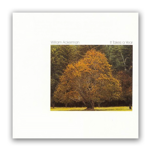
William Ackerman's "It Takes a Year", c. 1977
And finally, I’m a big fan of album art from the days when music came on vinyl discs (now I’m really dating myself). I was always a sucker for a well-designed album cover, and I cherished the covers at least as much as the music they contained (spoken like a true visual artist). On the basis of their album artwork alone, two of my favorite record labels were the original Windham Hill (when they were still owned by William Ackerman, and before they were turned into a new age hit factory by BGM), and the venerable jazz label ECM (founded in Munich, Germany, in 1969 by Manfred Eicher). I still count those album covers as important influences on my work, both in graphic design and photography.
Mahany Pond
Mahany Pond
The Passing of an Old Friend
The Passing of an Old Friend
Seeking Answers
Mahany Wetlands, Study 3
“When I photograph, what I’m really doing is seeking answers to things.”
— Wynn Bullock
An Art of Observation
Storm Clouds Over Mahany Wetlands, Study 2
"To me, photography is an art of observation. It’s about finding something interesting in an ordinary place… I’ve found it has little to do with the things you see and everything to do with the way you see them.”
— Elliott Erwitt
Storm Clouds Over Mahany Wetlands
Storm Clouds Over Mahany Wetlands
Storm Clouds Over Oak Copse
Storm Clouds Over Oak Copse