Valley Oak at Sunrise
ASPECT RATIOS
Before the advent of digital photography, the physical characteristics of the recording medium (film) had much to do with the physical characteristics of the final print. There was the ability to crop an image in the darkroom, but in most cases, the aspect ratio of the final print matched the aspect ratio of the negative. Today, we have no such constraints. Many digital cameras provide the option of setting a handful of different aspect ratios in-camera, and of course, cropping in post is no more than a one-click operation.
This freedom to determine the aspect ratio of every image on the fly puts tremendous pressure on the photographer. Failing to choose an aspect ratio prior to composing an image is like trying to design a page layout without knowing the size or shape of the page. Whether it's the native aspect ratio of the digital sensor, or some other aspect ratio chosen for aesthetic reasons, it's good practice to choose an image shape before bringing the viewfinder up to the eye. Doing so provides a solid framework for setting up a composition, while failing to do so changes the process of image composition from one of careful consideration to one of mostly luck and happenstance.
Why SQUARE?
The 120 film format was popular in the mid-20th Century and is still available today. Cameras that take 120 film are often called Medium Format cameras. 120 film allows several aspect ratios, including 1.5:1, 1.35:1, and 1:1. A number of my favorite photographers from that era shot 120 film in the 6x6 (1:1 aspect ratio) square format. Their influence is one of the reasons why I choose to shoot square images on a digital camera with a rectangular sensor.
Another reason is related to my work as a graphic artist. In the world of graphic design—particularly print design—artists are working in rectangles nearly 100% of the time. After doing this for decades, one naturally gets pretty good at parsing out rectangles. For me, the square format provides a fresh, more interesting challenge that requires a higher degree of intuitive thinking. It also frees me up from adherence to the classical rules of composition that are so deeply ingrained in the rectangle.
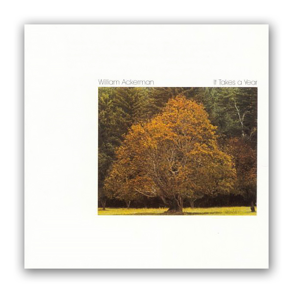
William Ackerman's "It Takes a Year", c. 1977
And finally, I’m a big fan of album art from the days when music came on vinyl discs (now I’m really dating myself). I was always a sucker for a well-designed album cover, and I cherished the covers at least as much as the music they contained (spoken like a true visual artist). On the basis of their album artwork alone, two of my favorite record labels were the original Windham Hill (when they were still owned by William Ackerman, and before they were turned into a new age hit factory by BGM), and the venerable jazz label ECM (founded in Munich, Germany, in 1969 by Manfred Eicher). I still count those album covers as important influences on my work, both in graphic design and photography.